Every business is the same. Cost of products, overhead, expenses and the creation of a product that people want to buy or use. Ideally there will be a profit to justify the effort, otherwise it is what it is and that can also be called "Busyness". Once we boil down our personal efforts and realize that staying in business is just a way to stay busy, then the shit hits the fan and the ends may not seem to justify the end. Who wouldn't want to do something else than to trade goods and take risk with very little potential for financial benefit? I only bring this up because the word on the street is that the hoopla about a recovery seems false at it's core. I was at my dentist today, Dr. Randolph Yip, a family dentist who also offers Cosmetic Dental Care in San Francisco, and it was very clear that even his customers are delaying dental care because of losing their dental insurance and employment, thereby affecting the bottom line of his business. Yet, simultaneously the stock market is up 35% this year???
The unemployment rate is still rising and in the end the net effect of more people being out of work will remove cash from the retail world and thereby continue to slow the potential for profit for real-world stores. Facts are facts and the fact here is that the stock market is a projection of better days ahead for some of us. If I had the time I would detail a rationalization on why the stock market is an accurate barometer and if we all believe then it's predictions will come true, but I have loss my innocent optimism for such folly. The only way I can accept the numbers is by assuming there is a major detachment between the reality of peoples lives and the numerical statistics that we tend to gauge our lives by. Speculation is a beast that we have incorporated into our capitalistic system, which is ballsy to say the least. The only way we can say that a 35% increase in the stock market is rationale is to recognize that the market was oversold before this rise began. Otherwise we have to reach the conclusion that it is now overbought. Regardless, in the real world of business the types of people who have lost jobs are not finding an equal number of jobs available for every 100 points that the market is rising. There is no industry replacing what has been lost. There is no super product that we are making that will provide us with a backbone to rebuild the economy and provide mass employment. We are wishful, but these are not the times for mass delusions.
The magic answer to the economic problems is not to give up because the facts don't make sense with the reality. Everyone needs to crunch their own numbers and find a way to survive. I've turned a lot of corners and have somehow made ends meet over the years and realize that change is required and our old paradigms simply provided for survival, but that is no longer a guarantee as we move into a new era. I have always believed that creativity and inspiration are the essence of individual success and that translates into societal success. Trying to interpret that for our current times is like a fly swatting itself. I like to work on several different levels and mix the results. I feel like my art influences my skills and my skills give me something to do, which in the end is my business and marketing my business keeps me busy and so on.
My current problem is that I don't believe that the market reality doesn't match the real-world factual reality. At the same time I have been running ads on my websites and find that I get more business when I run ads that often times show my competitors. This is a real problem, because when I cut my ads I am cutting my revenue which helps supplement the cost of my web presence. My basic assumption is that by redirecting traffic to my competitors I may be losing business, but the opposite seems to happen each time I stop running ads. I don't want to believe the facts, but more ads seems to equal more business. I don't have a full-proof way to test this because my main revenue stream comes from my main website at yque.com. Is there any rationale basis for this?
My conclusion is, if it is true that more ads equal more business, that by running ads I am providing a form of comparison shopping. In fact I think I will rename my ads and encourage my competitors to publish on my best web pages as a way to provide comparison shopping. I assume that the people advertising must have the most agressive pricing and products or they wouldn't be advertising to begin with, so if I can beat them then I am more likely to close the deal. This is my Mad Men moment when I push a new concept onto the market. Most likely other companies will benefit from this more than me since I work in a niche that is like a guy selling watches on the street corner, but WTF, it doesn't bother me to be the Guinea Pig for other businesses, I'm used to it. Packaging is the key so I am going to rename my advertising sections as Comparison Shopping Links and push forward in getting more competitors to sell through my spaces. I still don't totally understand if this makes sense from the customers standpoint, so if you have any ideas on this please send me an email or post a comment. thnx
Friday, October 16, 2009
Sunday, October 11, 2009
Nobel Prize Winning Chia Obama

It is never too late to come out with another Chia and it's never too late to make fun of a controversy with a t-shirt. The Obama Chia is way crazier than any other Chia and it won't be around for long since the major seller of the item CVS Pharmacy has pulled the item. Now we are going to be left with ad after ad of the Obama Chia kinda like Head On or whatever that stuff was you are supposed to rub on your head. I do want one of those Snuggie blankets though before it gets too cold around here and they run out. Obama may definitely be the first Nobel Peace Prize winning Chia. Fact Check.
Saturday, October 10, 2009
Pantone Color matching for T-shirt printing - A great place to start, but...
Yes and No. Yes t-shirt printers and match pantone colors and many have complex systems and ink mixing machines that help with the process. However this is only reasonable for large jobs. I've found that even when you do match a pantone color for a print job the inks can look different wet than dry and surprise it's still not exact. Also the color of the shirt next to the ink can affect your eye which changes the perception of the color. Mixing a pantone color for screenprinting also must take into account that the person using the pantone book should use Uncoated reference chips and not coated. Screen vibrancy is nothing compared to flat cloth, so don't think that a backlight design shown on a computer is going to look the same. In fact, I think it often looks better in ink on cloth, but that is a matter of opinion. Pantone numbers are great references for screenprinting but they only put you in the ballpark. Always think of pantone colors as a range of colors or as a reference for the rest of us. The final result will be hue on one side of the color or the other. Paper printing is different and Pantones were created for that industry, which explains the difference. Screen printing is like starting a fire with two rocks compared to the detail and accuracy available in offset printing. Here is a link to links for Pantone Color systems.
Thursday, September 24, 2009
Cheery OH and the Friggin' Libor Bank Rate
0.68, can you believe that? Hell know. I woulda never thunk it, but it is true. The Libor is at a historic low and you should let everyone know that. Why? I'm not sure, but I am sure that it affects a lot of shit and the more people that know about it then the more people that are completely caught up in a world of isolated numerical facts that will be able to eventually bore each other to death. God Save the Libor. Oh, and I am printing this shirt with the daily libor rate printed with the date. Long Live the LIBOR!
Friday, September 18, 2009
Photo Fresco Mosaic Buddha - 10 Steps to Self Enlightment through Destruction
Mysterious Crystal Cube From Buddha for Photo Fresco Destruction

First off I am not sure where this will end. Every time I turn the page, thinking that I must be near the final product, I find a new twist or turn that makes making these things intrinsically divine. Today I found a crystal cube laying in the ground when I was looking for something to break my fresco Buddha print on. The crazy thing is that it appeared that the leaves around it were pointing to it or spelling some word in a Hebrew or Japanese font. Silly me, but if you have any idea if the leaves surrounding this "crystal cube", for lack of a better word, might spell something then leave a comment below. Otherwise it did make me look twice and simply pickup the "cube" in order to have a hard surface to break this photo fresco print on.
Photo Fresco Mosaic

So now what do I do? It's not easy to drop the Fresco, but it is kinda fun knowing that I can put all the pieces back together again. Here is a link to the Photo Gallery showing the Assembly of the Photo Fresco into a Mosaic of sorts. Here is an image of the Now Final Product:

Thursday, September 17, 2009
Photo Frescos Return via Warhol Stolen Art Heist - Merge into Mosaics

Kareem Abdul Jabbar PhotFresco Mosaics in Reverse Order from Original Stolen Warhol Painting
Click for Gallery of complete Set of Warhol Stolen PaintingsThis sequence of images show the image progression from digital photo to PhotFresco Mosaic
Photo Fresco Warhol Painting Mosaic Gallery Images here.
It's a long story from a place very far away. I have been experimenting over the years with merging photography with plaster to create plaster prints that are theoretically more permanent than some other mediums like Florentine Renaissance Fresco paintings survived well because of the use of plaster with the pigments. Most importantly the blending of color that occurs with wet plaster mixes pigments in a marbled way that changes as it dries and often creates something not exactly like the original.

Here is a PhotFresco version of the Warhol Kareem Abdul Jabbar Painting that was stolen in LA
As a photographer I sort of hate literal duplication of images, which is why screen printing is generally hack work that I have to do to make a living, not exactly the most thrilling task on earth. I've mentioned this many times here and we don't need to go there, but with mixing a photographic image into plaster I enjoy the duplication process as it makes the image seem more painterly, yet takes advantage of the microscopic detail that only photography can provide.

Original Warhol Painting of Kareem Abdul Jabbar from digital Crime Alert Poster of the 11 Stolen Paintings
When I was a photographer of sorts, traveling around the country in the eighties with 35mm cameras and black and white film, I realized that I enjoyed blurry photos more than sharp detail. This led to the conclusion that my photographs really didn't work for most people because it took enjoying the sense of motion that I was getting and basically it just wasn't worth showing people photos or trying to make a camera act like a paint brush in black and white. I moved towards more commercial and graphic endeavors like screen printing and eventually stopped using my own images in my work.
Over the years, as a screen printer, I've delved into Warhol style paintings and sold quite a few on the streets of San Francisco, matching celebrity and news images into color schemes on canvas and stretching them on wood. Fun during the off season of t-shirts, but I stopped as I started doing bigger works and later I just got too busy printing t-shirts. A few years back while making plaster lamp bases I started molding images into the work. Nothing has worked successfully, but every now and then I got a glimpse of where it could go and what it could be. This year I sort of got somewhere with transfering images into wet plaster and building molds that are self-contained frames. This is always interesting as a process since it goes from a wet process like photography to a dry process like a print, but it is cast in plaster which makes the final product also like sculpture.
This leads me from where I began and to where I am. I have always tried to avoid Warhol style work unsuccessfully. It's terrible because I like the merging of photography with painting and the people on the streets loved it. Personally I thought it was demeaning to do portraits of famous people, but the impact of the images was overwhelming. I was not a painter and I used inks in my printing that were also t-shirt printing inks, but more and more the images were attempts at making something that people liked and I just didn't get that far away with painting to make it somthing different, but it worked for selling paintings in a basic way and I did it over the years. My larger work was an attempt to mix images to use smaller screens and make something larger by randomly printing images all over the canvas. It was fun, but nothing like the Pollackian style that I thought it was. Later I found that only one or two images worked just as well as 50 images and this type of juxtaposition can insert meaning from two different objects. T-shirt printing designs over the past 5 years have exploited this technique to the nth degree and I'm bored with that too. Blah, blah, blah. What this means is that the Love-Hate thing with Warhol just won't go away.
 Now I just finished working on a technique for Phot-Fresco, as I call it, and there was an art heist in Los Angeles of 11 Warhol Paintings. These prints were sent out on a Crime Alert from the LAPD and I was impressed with the group of prints as subject matter for my Phot-Frescos. I mixed, printed and dried a batch of flat rock paintings to get the transition from Warhol to Fresco. I was quite happy with the mix although it really didn't do enough to make me feel I could call it my own. Archiving Warhol's work was fun to show how my Frescos worked, but Where's the Art in making something look marbled in rock? Then while a stack of prints were drying in my walkway they fell some time during the day and broke into a pile of rubble. Feeling no loss I picked up the pieces and arranged them on a table like putting puzzles back together. Not only was I impressed with the Mosaic effect that resulted I now felt like I had added something to the work that I could appreciate.
Here is a photo gallery of the Warhol Stolen Art Paintings PhotFresco Mosaics. Now say that 5 times.
Tuesday, September 15, 2009
Typical problem - typical solution - SNAFU
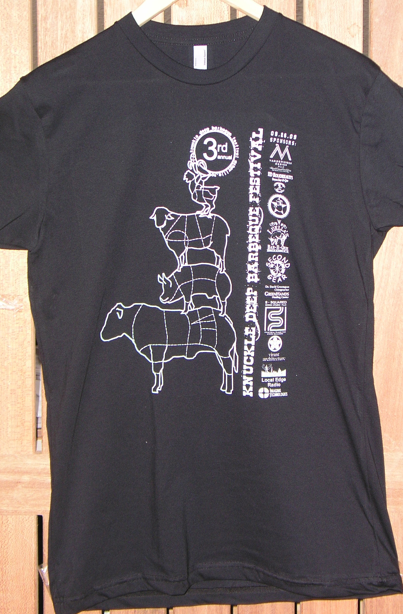
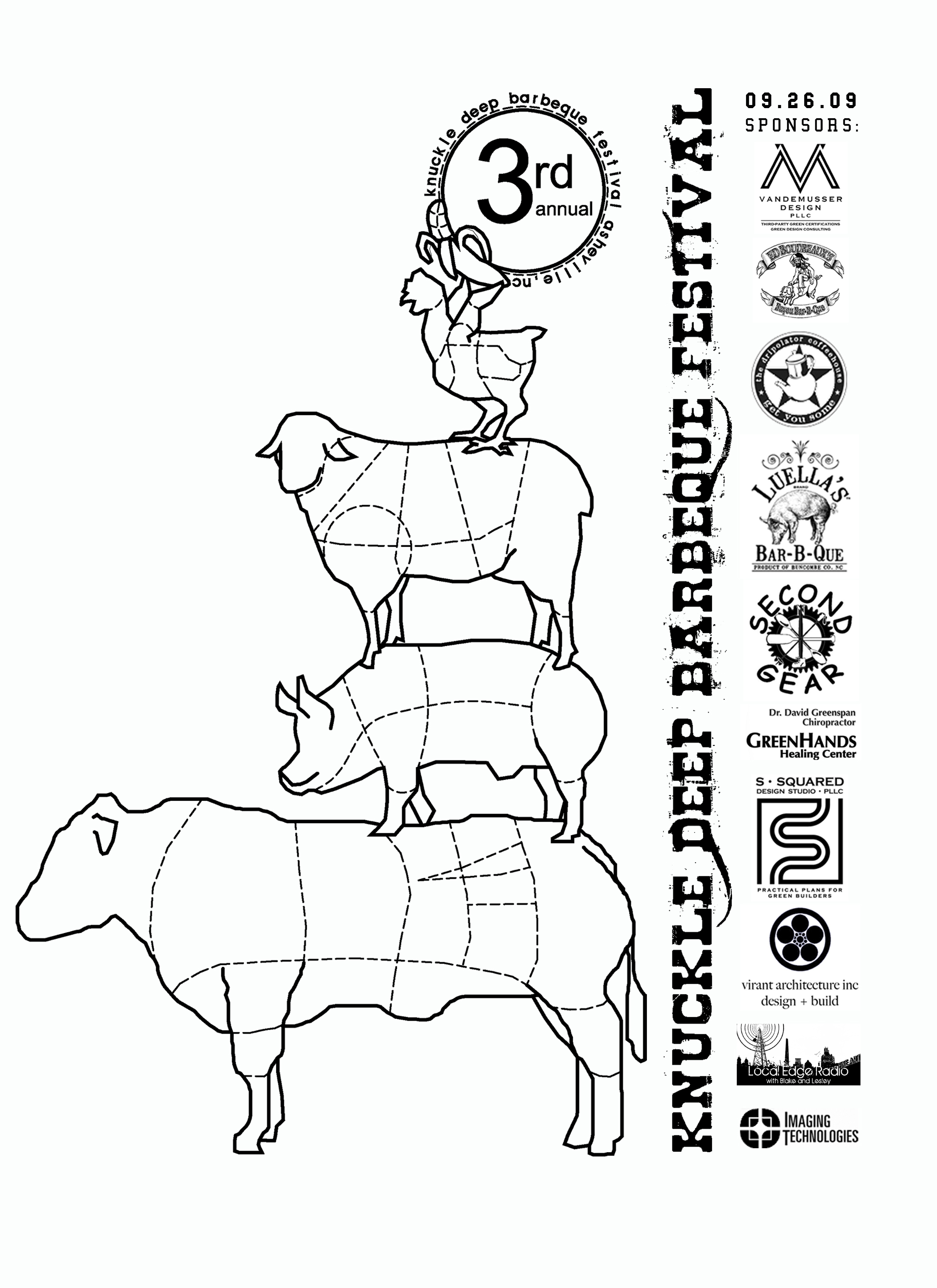
 This is a typical artwork problem when you have a bunch of sponsors and you've agreed to put their logo on the shirt for your event. The people are happy to provide you with a disk or business card and on it is a half readable 1" design in 15 colors that is supposed to fit with 10 other randomly supplied pieces of artwork. Somebody has to do the dirty work and put these together, but the real problem is getting something to print in 1 or 2 colors without destroying the logos themselves.
I am tired of saying that anything can be done, because anything can be done. If you've got an image then somebody and put that on a shirt, but it may not be affordable and it may look like crap. The real issue with t-shirt printing is keeping it affordable and taking a pile of crappy artwork and turning it into something that can be printed at a reasonable price. The sample shown here is just that and with the contrast increased and the designs filled in accordingly it turned out to be a decent print. When I looked at the original which was a low resolution version of the same it was hard to see the detail because of all the blurriness within the logos themselves. Always remember when you are doing a job with sponsors that you can't kill yourself trying to make their logos print perfectly or your own design will suffer. Here is a link to a larger version of this artwork. Also I am providing a link to the original artwork so you can see where they started with this design.
Typically we charge $50 an hour to play with this type of design, but if the customer seems flexible and willing to pay for a new screen in case they aren't happy then sometimes we'll do a hack modification like this one without charging. It really depends on the design. The worst job of all is getting a disk with a huge list of files that are different sizes and the customer wants them arranged around their logo. We don't touch that type of artwork without an advance deposit, warnings and disclaimers galore. Now that were done here, Where's The Ribs?
Subscribe to:
Comments (Atom)